ONG É Por Amor presents its new visual identity and strengthens its institutional presence
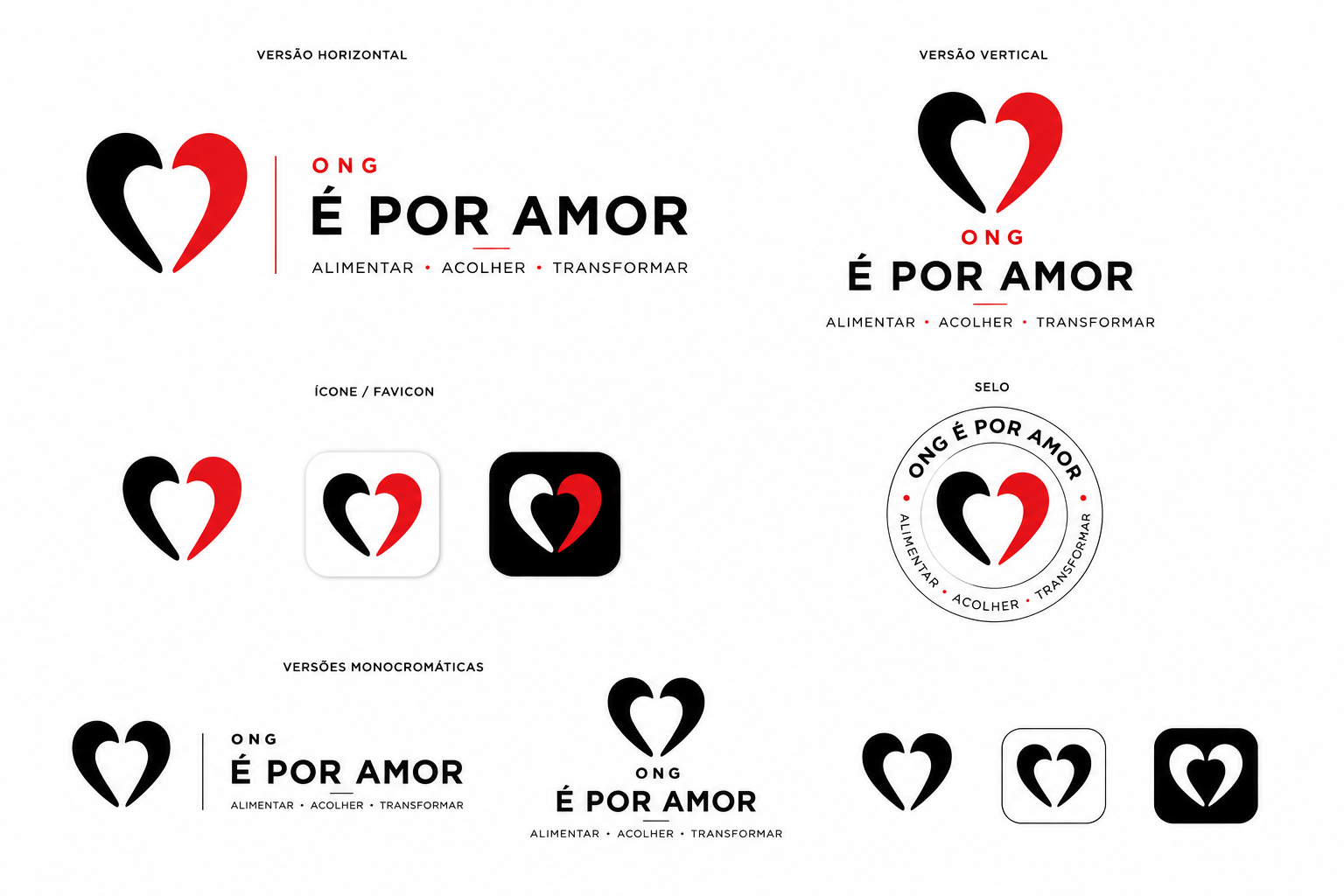
ONG É Por Amor presents its new visual identity, an important milestone in the organization’s process of institutional maturity. More than an aesthetic change, the new brand represents a phase of greater clarity, presence and professionalization for the NGO.
Since its founding, ONG É Por Amor has built its journey on a direct commitment to fighting hunger and poverty. The organization was born from concrete action, field presence, listening to urgent needs and mobilizing people willing to help. Over time, this work has grown, expanded into new areas and began to require stronger communication, capable of conveying trust, seriousness and continuity.
The new brand was born from this moment.
The previous black-and-white logo was part of the NGO’s history and accompanied important stages in its development. It represented the beginning, the urgency, the strength of mobilization and the organization’s emotional identity. However, this new phase of ONG É Por Amor calls for a more mature, more institutional brand, better prepared to communicate with different audiences: donors, volunteers, companies, ESG partners, foundations, the press and the community.
The new identity preserves the essence of the organization, while presenting it in a stronger and more contemporary way. The heart, the central symbol of the brand, remains present as an expression of care, humanity and commitment. But it now appears in a cleaner, more direct and symbolic form, within a more sober and institutional visual composition.
The use of black reinforces weight, seriousness and stability. White brings clarity, simplicity and breathing space. Together, they create a brand that is easy to read, visually strong and more versatile across different applications: website, documents, reports, social media, institutional presentations, printed materials, uniforms and communication pieces.
This change also reflects a vision for the future. ONG É Por Amor has been preparing to expand its capacity for action, strengthen its transparency, better structure its projects and build closer relationships with companies and partners seeking real social impact. For this, the visual identity needs to convey not only care, but also competence, organization and credibility.
The new brand does not break with the NGO’s history. It organizes that history visually. Love remains at the center, but is now presented with greater maturity, greater clarity and stronger institutional presence.
In a social organization, visual identity is not just an image. It communicates posture. It tells the public how the institution sees itself and how it wants to be perceived. In the case of ONG É Por Amor, the new brand communicates an organization that remains human, but is also better prepared; that remains close to people, but with greater structure; that remains driven by love, but with responsibility, transparency and a long-term vision.
The logo change therefore marks a new stage: ONG É Por Amor remains the same in its mission, but moves forward in the way it presents itself to the world.
Fighting hunger. Cultivating dignity.